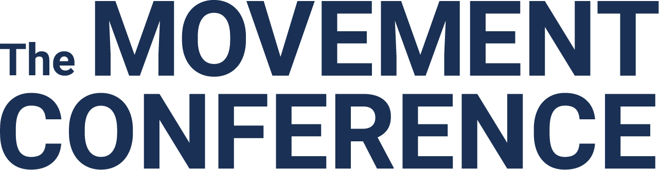
THE MOVEMENT CONFERENCE
DATE 2023
Humanizing Tech, Voices Amplified.
BRANDING LEAD
ART DIRECTION
PRINT DESIGN
The Movement Cooperative (TMC) is a collective of independent organizations working together to advance the progressive movement through common infrastructure. Fufu + Grits partnered with The Movement Cooperative to create a comprehensive brand and system for their 2023 Movement Conference hosted in St. Louis, Missouri.
MOODBOARD
![]()
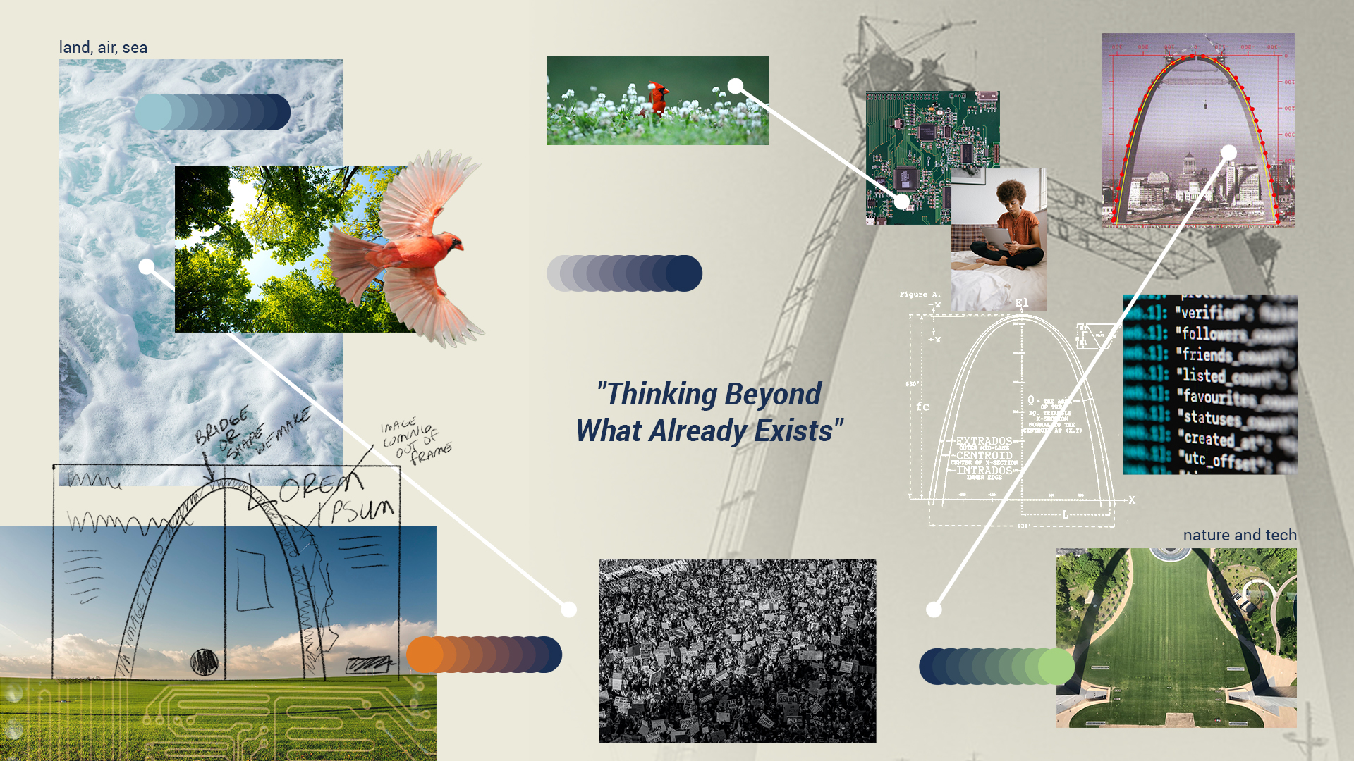
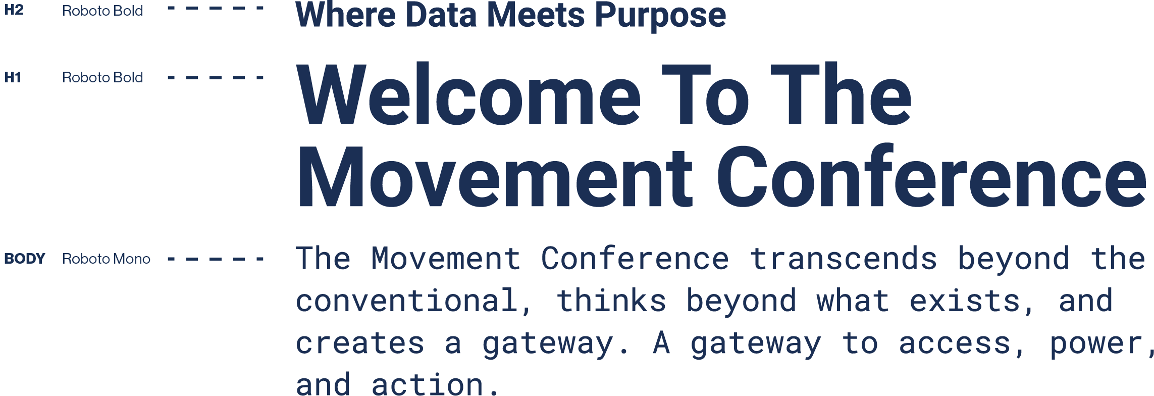
Thinking Beyond Conventional.
During the design process, we developed innovative ideas that went beyond the conventional, creating an identity for The Movement Conference. This identity visually bridged the gap, connecting funders, organizers, and field staff by incorporating organic elements of nature and technology. The resulting design aligns seamlessly with the forward and intentional mission of The Movement Conference.LOGO
The logo humanizes technology, emphasizing the people and networks involved, drawing inspiration from The Gateway Arch. It highlights interconnectivity and motion, bridging the gap between access, movement, and nature. The design feels both progressive and approachable.
The logo humanizes technology, emphasizing the people and networks involved, drawing inspiration from The Gateway Arch. It highlights interconnectivity and motion, bridging the gap between access, movement, and nature. The design feels both progressive and approachable.
LOGO ANATOMY
Understanding the different parts of a design provides insight into its overall composition and helps tell a deeper story.
Understanding the different parts of a design provides insight into its overall composition and helps tell a deeper story.
LOGO VARIATIONS
Horizontal
![]()
Wordmark
![]()
Wordmark
Stacked (St. Louis)
![]()
Logomark
![]()
TYPOGRAPHY
The brand employs Roboto and Roboto Mono. Roboto combines geometric and organic shapes, while Roboto Mono, designed for readability, complements the tech theme, enhancing accessibility for users.
The brand employs Roboto and Roboto Mono. Roboto combines geometric and organic shapes, while Roboto Mono, designed for readability, complements the tech theme, enhancing accessibility for users.
COLOR PALETTE
The Movement Cooperative sought a balanced color palette aligning with their collective vision. Rooted in the organization's organic ethos, we crafted a color narrative inspired by natural elements: land, air, and sea.
The Movement Cooperative sought a balanced color palette aligning with their collective vision. Rooted in the organization's organic ethos, we crafted a color narrative inspired by natural elements: land, air, and sea.


GRADIENT
Gradients were incorporated as background elements, providing depth and visual interest. This technique also created a sense of movement, guiding the viewer's eye through various compositions.
Gradients were incorporated as background elements, providing depth and visual interest. This technique also created a sense of movement, guiding the viewer's eye through various compositions.


ICONS
Icons were designed to help distinguish programming throughout the conference. These icons echo the construction of the conference logo, drawing inspiration from the brand's mission to humanize technology.
Icons were designed to help distinguish programming throughout the conference. These icons echo the construction of the conference logo, drawing inspiration from the brand's mission to humanize technology.
Digital + Organization
![]()
Innovation + Culture
![]()
Technology
![]()
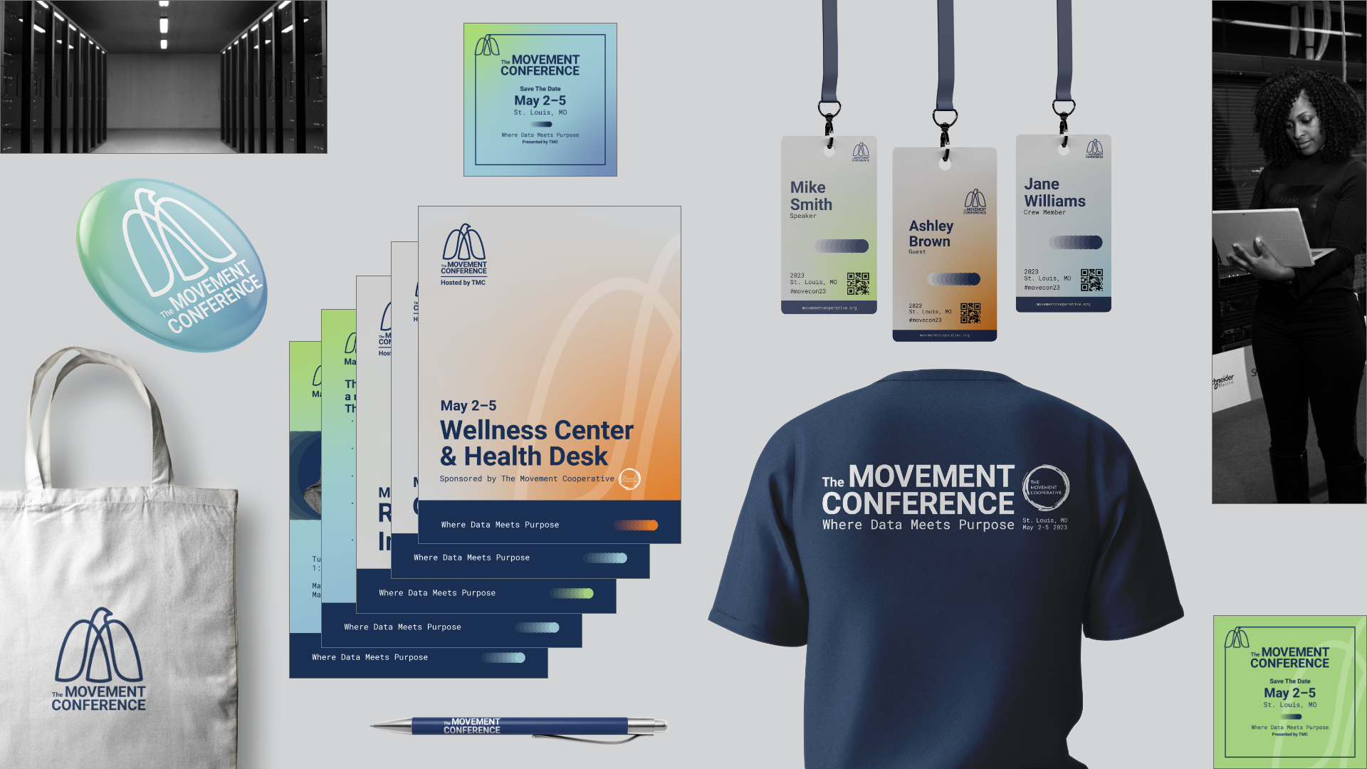
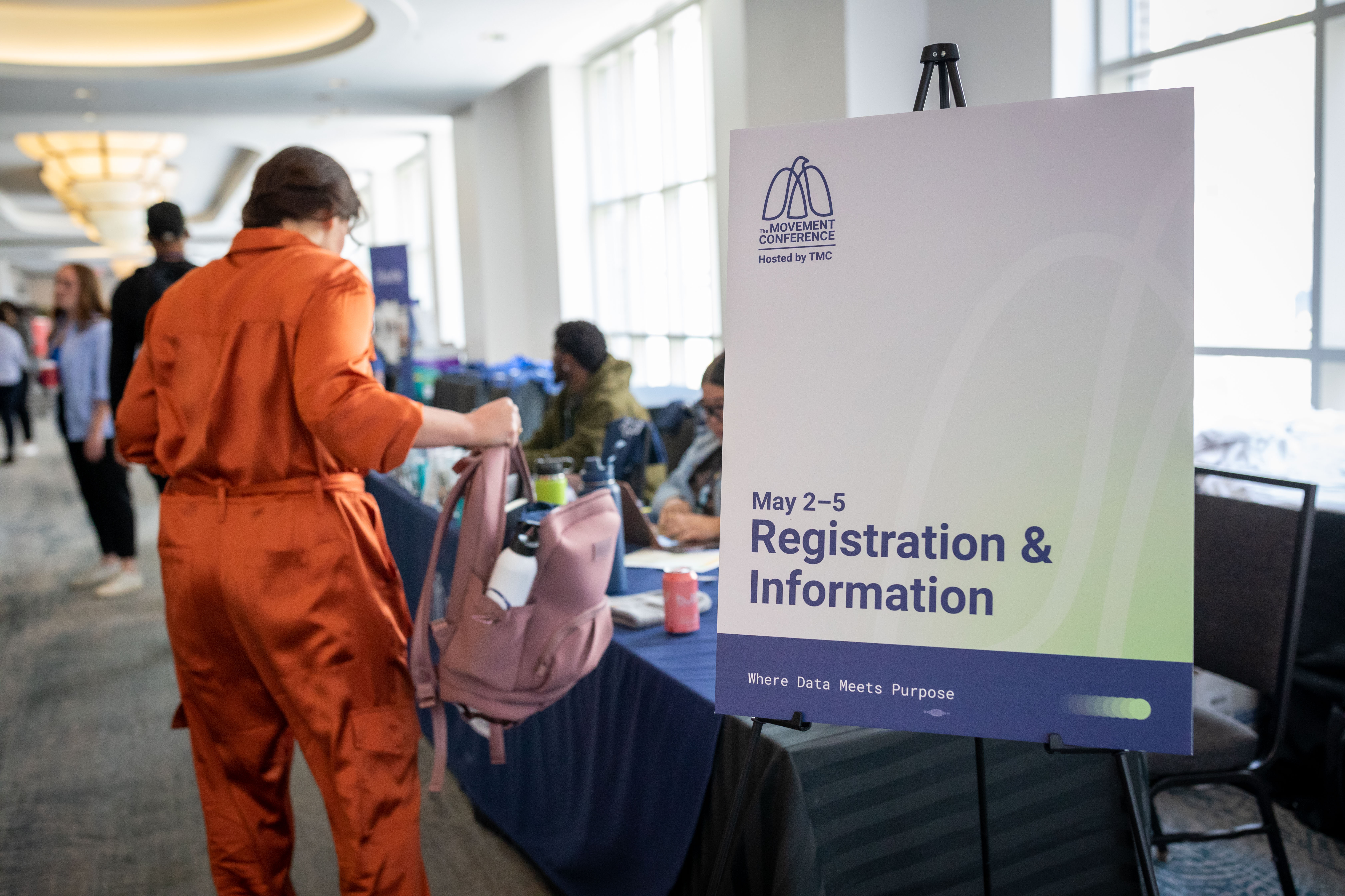
Connecting Data & Purpose.
The essence of The Movement Conference's identity lies in its empathetic approach to managing accessible tech data. We utilized a dynamic and adaptable framework of color, typography, and language to build a cohesive identity that resonates with the organization's values across all conference touchpoints.